Sprucing Up Service
Make It Sexy: Tips for Sprucing Up Service
Don’t just make room for the service department. Design it.
 Step 1: Get a Bird’ s-Eye View
To help the department live up to its potential, step back, and look at service strategically. One of the most common mistakes we see is shops that rush into changing things solely, it seems, for the sake of changing things. It’s fun to jump in, swing hammers, and create exciting new features in the store, but it takes proper planning to avoid making changes that hurt rather than help you. Analyzing the store, asking tough questions, and coming up with a plan isn’t sexy, but using the following steps as a guide will make the process easier, fun, and, most importantly, more effective.
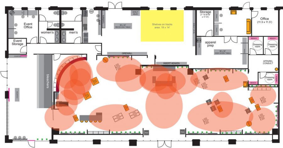
Even if you don’t have the fancy kind of floor plan Fixture Lab generates for its customers, it’s still vital to create even a simple one, so you can see how your service area impacts the rest of the store. If you’re creating one from scratch, try using graph paper to draw an accurate representation of your whole space, where each square represents one square foot. Include bikes on the plan—being careful to draw bikes accurately to scale and indicate the product on display.
Start with a floor plan of the current store layout, which will help you get a firm grip on how much space everything takes. Once you have the as-is idea, it’ll be easy to draw variations that explore solutions in different ways. Don’t skip this part. It’s free to change your mind on paper, but it’s much more expensive once you start tearing walls down and moving things.
You don’t want to fix things that aren’t broken, so it’s also a great idea to look at the numbers for your store before you start remodeling. As you look at numbers, ask yourself these questions:
- What does service mean to the store financially? What could it mean if we were doing things even better?
- If we’re underperforming, is it because we haven’t priced our services, right?
- How long does the typical service transaction take? If we increased it, what would the effect be?
- How much does our service business vary, from day to day or hour to hour?
- How do we/will we measure the efficiency of service?
- Would a change to the service department mean displacing other profitable things?
- If we create an open service area, will it serve people to view customers cost us more?
Step 2: Observe the Store
You guessed it. This is another time when stepping back and looking at the store with fresh eyes is super smart. Take time to watch the flow of customers through the store.
Hot tip: Shooting a few days of time-lapse footage in the store is pretty easy, and can help you quickly identify customer behavioral patterns that you miss in real-time. There are plenty of simple, affordable time-lapse cameras available on the market, including the Brinno TLC200.
Ask yourself these questions as you watch:
- What are the primary paths that customers and employees take?
- Where do people tend to bunch up?
- Are there physical barriers in the space?
- Do customers figure out where to go quickly?
- What would our ideal customer need/want in the area?
The answers aren’t always what you’d expect. Sometimes it’s as simple as bike rentals causing a logjam. Sometimes customers are parked in the service area too long (in which case making the area even comfier could hurt you). Maybe your service staff is too distracted when customers are nearby. Or perhaps service isn’t your real problem at all. Maybe you don’t have adequate space in the back for completed service bikes to transition to, and they clog valuable space in the service area. Or maybe the problem is that your customers are lost, or you don’t know how to help your efficiency. If that’s the case, then your solution might be as simple as improved signage.
Step 3: Make Sure You’ve Mastered the Basics
Metaphorically speaking, everyone wants to run down the court and slam-dunk the ball. The problem is that you can’t win the game by doing just that. You need to play good defense, and you need to be proficient at the necessary shots, or you’ll never win the game. In a bike shop, it just doesn’t make sense to build a new service area with fancy digital displays, reclaimed wood walls, and gorgeous steel countertops if your staff is impolite, or your quality of service isn’t consistently top-notch.
Don’t bother redesigning your service area until you have these basics down pat:
- Clean up!
- Create best practice guidelines for employees and consistently enforce the rules.
- Don’t clutter the space with bikes or anything else that isn’t mission-critical for your transactions.
- Provide clear signage for services offered, prices, and shop procedures.
“We see shops putting more emphasis on their service department these days—hiring more people, increasing the department’s size, and moving it into more prominent locations in the store.”
— Jeff Donaldson, Barnett Bicycle Institute
Step 4: Get to It!
Well, maybe it’s not quite that simple. But now that you’ve spent a good deal of time assessing the layout and flow of your store, you’re better equipped to formulate a plan that will make your service department more efficient and, one hopes, more profitable. Even so, there are plenty of pitfalls that can trap unsuspecting retailers as they consider a redesign. Here are some of the most common design solutions we see that are best implemented with caution, a few common mistakes, and what you should be considering to make sure you’re doing what’s best for business.
Solution #1: Moving the Service Department
There’s an exciting trend of shops moving their service departments to more prominent locations, such as the center of the store, or even closer to the front door. But you shouldn’t necessarily follow suit, unless you’re changing over to a selling model with a more open floor plan, or need to incorporate the staff that will build and works on bikes into the middle of things. Be careful not to rush into this solution, though, as it may create more problems than it solves.
If you simply want to make the service department stand out more, you have plenty of more straightforward solutions to try before supplanting your most valuable retail real estate:
- Clear visual obstructions/clean up the path to it (and don’t ignore the fact that while hanging bikes frees up floor space, it can block important sightlines)
- Improve signage
- Improve the localized aesthetics, so that service attracts the eye
Solution #2: Expanding Service
If your service department is already busting at the seams, then you should be making moves to relieve that pressure, since the forecast for bicycle service is bright into the foreseeable future.
You should also be careful to consider whether your problems are indeed an issue of department size. If your area feels too small, but it’s because you leave too many service bikes in the area after the customer leaves the store, then your solution might be to handle the processing of the bikes better. Another common mistake we see is shops placing too much product inside the service area itself. It’s great to have the product close-at-hand, but if it’s clogging the smooth operation of the area, you owe it to yourself to try moving the product first.
Solution #3: Showing Too Much of Service
If you want the department seen from all parts of the store, you could move it to the middle of the store. There are a few stores around the country that do an excellent job of creating great theater to expose the department entirely, but it’s not the right choice for every store.
Exposing the service area is a good idea if:
- You enjoy having customers actively participating in (or working on) the repair process
- Your store is great at keeping the department clean and organized
- Budgetarily, the same people, need to work in service and watch the rest of the retail space
Exposing the service area is not a good idea if:
- Your employees tend to be messy
- Your service business varies greatly from day to day (during slow times, a vacant service area doesn’t look great)
- Your employees are prone to distraction
- Some of your service staff seems a bit rough around the edges
I feel that there are very few stores where exposing the entire service department makes sense. I love a bit of service theater in just about every store, but many day-to-day parts of service just aren’t pretty, so they shouldn’t be on display.
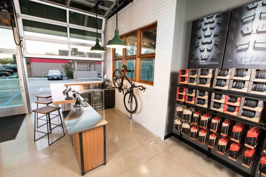
Hot tip: Sometimes, a simple window between the service department and the rest of the store can create the perfect amount of service theater, without fully exposing the less-than-pretty side of service.
Solution #4: Giving Service Its Door
You may want a separate entrance that allows service customers to get in and out efficiently—and it’s often feasible to put an outside door next to your service department. Beware, though. Giving customers a short path between the door and the service department severely limits their exposure to all the great stuff you’re selling. That’s why grocery stores don’t put milk near the front of the store. Sure, it’s a bit of a chore for your customers to walk their repair bikes through the store to the service department, but think of all the fantastic selling opportunities you can present. Especially if you seize the chance to be entertaining, and offer them fun products.
Mistake #1: Letting a Service Person Design the Department
There are a few things you can count on in life—death, taxes, and that if a service person designs a store, the service department will be too big. They need room to do their job, of course, but your store needs a great retail space. We typically shoot for the non-customer-facing areas of the store (which usually includes service) to be 30-40% of the total square footage. It’ll vary from store to store, but striking an appropriate balance between retail space and backrooms/service is vital.
Similar to this can help you identify potential “logjams” that might otherwise impede your store’s flow and lower its efficiency.” 
A heat map similar to this can help you identify potential “logjams” that might otherwise impede your store’s flow, and lower its efficiency.
Mistake #2: Ignoring Logjams
A logjam is where people or products—or sometimes just junk—pile up, preventing smooth flow and easy transactions. It’s the door to the backroom that’s too close to the service counter. It’s the narrow spot between bike displays. It’s the skinny doorway or stairway that’s nearly impossible to get a bike through. The service department is prone to these challenges, so if you’re looking to improve the design of that area, use your floor plan to assess—and relieve—logjams across the store. It’s entirely possible that your whole service department remodel might only require widening the doorway between service and storage to 6 feet, a simple move that can free up the entire area. When planning, shoot for all of your doors, hallways, and spaces between counters and walls to be a minimum of 4 feet wide. It’s not easy to puzzle out, but this kind of space allocation is worth it for your space’s efficiency.
Frequently, we create heat map overlays for our floor plans that show where people will concentrate. Even if you don’t go so far, thinking about the floor plan in this way is valuable. Way too often, floor plans crowd customers into one or two areas that become clogged. With this perspective, you might see that the best change you could make for the service department’s sake is to place another transaction counter in a different part of the store.
Mistake #3: Displaying Product in the Service Area
Displaying products in and around a service department is mission-critical. The transactions that take place in the area present unique opportunities to increase sales in a big way. But you need to be strategic. Don’t create displays that become inaccessible when customers are in the space. Keep those displays close-at-hand, but don’t put them where a customer’s body easily blocks them. While a glass-front case nearby is perfect, we call those outdated glass case counters “product coffins,” because that’s where otherwise good products go to die.
Mistake #4: Ignoring the Ugly Stuff
One of the most common problems when stores plan their space is not creating places for the ugly stuff in the service department. The day you finish the service department redesign is likely the cleanest, most organized day of its life, but minutes after you finish, the challenges sneak right back in. Make sure you’re honest with yourself about the way work needs to happen in that space on a busy Saturday, and give yourself the features necessary to make it work, and remain attractive:
- Nobody wants a big trash can in the floor plan, but it’s a lot better than a tiny one that’s continually overflowing.
- Countertops naturally collect crap, so create spaces to hide the ugly stuff from the customers’ view.
- Tools, bottles, cables, tubes, parts, etc. are almost always real eyesores, so put doors on the service cabinets/benches that face the customer. For the same reason, consider cabinets instead of open shelves in areas that the customer can see.

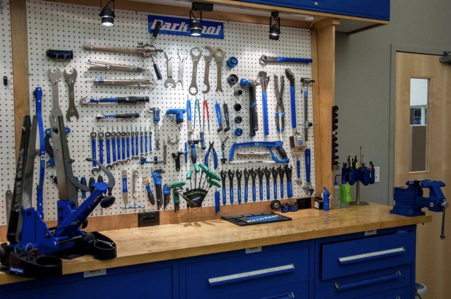
In the context of a service department, tools aren’t ugly, unless they’re scattered all over the place. There are different schools of thought on this topic, but we prefer to put tools on display on the pegboard in a very logical and organized way, rather than putting them in drawers where they’re out of sight. In our experience, the commonly used tools in drawers rarely make it back to the drawer in a day. If the tools aren’t in the drawers, then they’re sitting out, and usually scattered all over the place. We find that the odds of them making their way back to pegboard are way higher, making space look markedly better.
“A well organized, well-planned repair area, whether in a pro shop, at home, in a shed, or at a trailhead, needs to have tools in logical spots, so they’re easy to see, reach and use.”
— Park Tool, Shop Rag, Issue 15
Mistake #5: Assuming Your Customers Know What You Do/How You Do It
More often than not, this is a simple signage problem. The challenge of displaying useful information for your customers in a service department has existed as long as service departments have. The goal with graphics and signage in the service department isn’t to replace the employee’s communication; it speeds up the transaction. If a customer can quickly read a sign and ask a more informed question of your staff member, you’ll save time, and the customer feels more empowered. Don’t overwhelm your customers with too much to read, but give them vital information that helps them ask great questions. Don’t forget to brag a bit about the certifications you have, and the fantastic people in your store. Spread the word about how critical certified mechanics are in these days of online sales. One last note about signage: Have fun with it! You’re selling and servicing the most fun product in the world. No customer will be offended if your department has a great personality and/or gets their heart-pounding to get out and ride.
This post was authored by Brian Hawkins, President and Owner of Fixture Lab, and Strong supporter of Project Bike Tech. Fixture Lab provides excellent retail store design services and retail store fixture solutions that are unique to the cycling industry. Project Bike Tech creates amazing bike shop classes in high schools all over the country.
 The NBDA has been here since 1946, representing and empowering specialty bicycle dealers in the United States through education, communications, research, advocacy, member discount programs, and promotional opportunities. As shops are facing never-before-seen circumstances, these resources offer a lifeline. Together, we will weather this. We at the NBDA will not waver in our commitment to serving our members even during this challenging time—but we need your support.
Now is the time to become a member as we join together to make one another stronger. Whether you’re a retailer or an industry partner, your membership in the NBDA is one of the best investments you’ll make this year.
Learn more about the benefits of being a member and join now.


